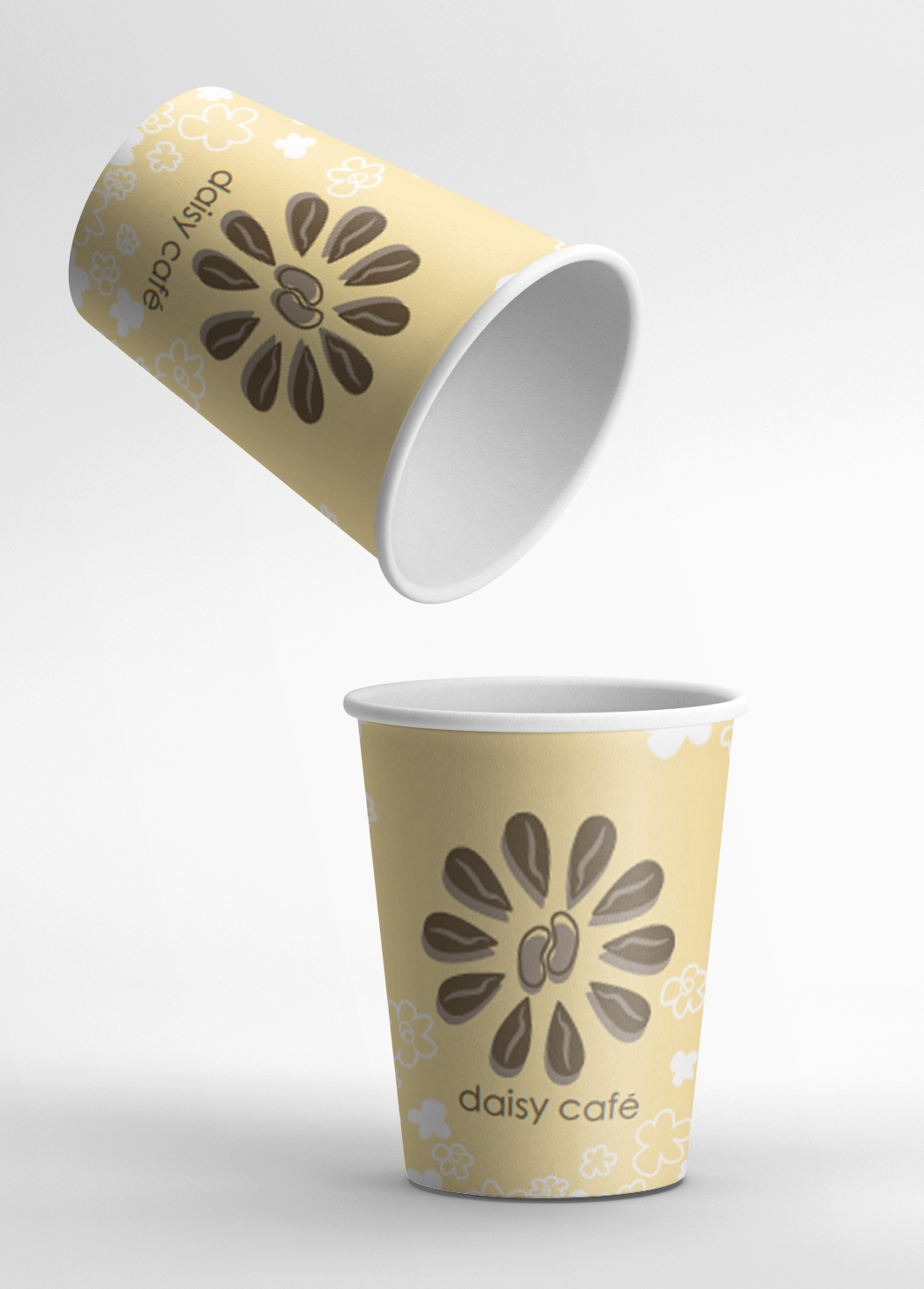
Mock-Up

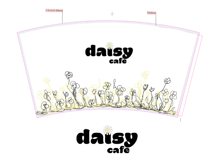
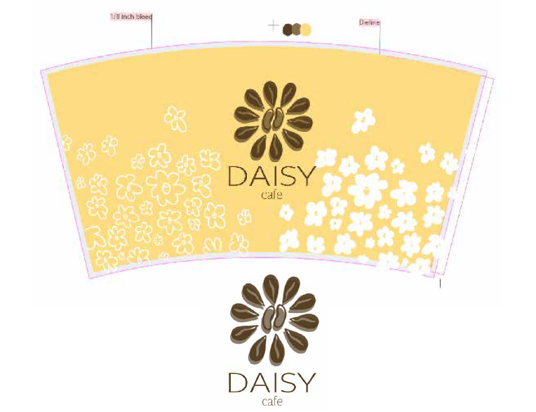
Cup Design
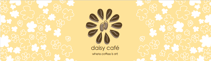
Store Front
PROCESS
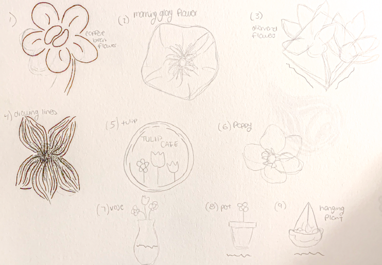
When going into this project I knew I wanted this coffee cup to be interactive in some way. So when creating Daisy Cafe, I wanted the customer to be able to draw on their coffee cup to make it their own. I wanted to use some bright and uplifting colours to contrast some of the darker brands you see. So based on that I chose the colour yellow and also brown to contrast the brightness. On the cup itself, I wanted the logo to be big and noticeable for marketing purposes and for the illustration to stand out but not take away from the logo. For the logo I wanted people to know that it was a coffee shop without it being from a coffee shop. I wanted the daisy and coffee beans to be incorporated to be one harmonious logo and easy for brand identity.
TOOLS USED
Adobe Illustrator
Rough Ideas
Logo Sketches

Logo Sketches
Rough 1